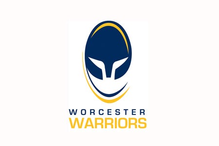
Worcester Warriors is today delighted to unveil its new official club logo which will become the emblem of the Guinness Premiership side as we look towards an exciting future.
The club’s identity has evolved over the years and the necessary decision has now been taken to align the club’s vision and values to its new logo, known as ‘The Warrior’, which will feature on the playing shirts from the 08/09 season.
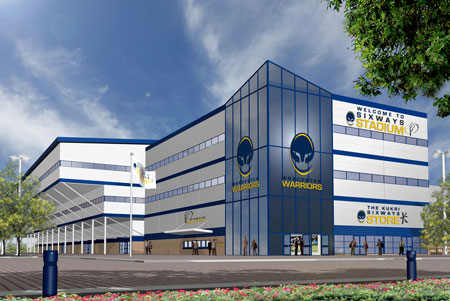
It has always been one of the club’s primary objectives to embrace the future and move forward. With a new-look stadium on the horizon and the Warriors firmly established in both the domestic and European game, the club believe this is the right time to all get behind the new image for the club.
The new identity was designed following an extensive research programme that included consultation with groups of supporters and other key stakeholders, including ex-players, club officials and long-standing members of staff.
These workshops were used to define the club’s values, vision and personality. Built around the club’s core values, the new logo has been created with a contemporary style that reflects the club’s vision.
Charlie Little, General Manager at Warriors, revealed the new logo had been designed to deliver the values of the club in a clear and dynamic way.
“The exciting new brand is a combination of the values we want as a club and I hope fans both like it and can see why we have made this change,” he said.
“As one of the 12 best rugby teams in the country we deserve to be a premium brand and therefore everything we do should be of the very highest standard. To do that we need everything in place for us to achieve that, it is not just doing it on the pitch. It is the whole culture, impression, service and feeling that you have from being associated with Warriors.
“Brand is a complex matter – it is not just the visual identity but also the values. We want everyone’s response to us to be that we are a company, rugby team and business that they want to be associated with. Something they can engage with and grow with, we want people to be a part of this club. The brand reflects all of that.”
The club has been working for several months with a Worcester-based company to ensure the new brand would be a long term success.
“We’ve gone out to our supporters and gained an understanding of what they feel is important to them and what our values should be,” added Little. “At a similar time we also started doing focus groups, in particular on the visual identity, to come up with a logo that itself reflected what these values and this brand was.
“We are a modern, innovative and forward-thinking organisation. You only need to look at recent events such as the Kukri kit and sponsorship deal and the multi-million pound East Stand development, as well as the unique relationship with our amateur club and non-matchday revenue to realise how this club can develop in the future.
“We employed a local company who know the city, Modus Creative, to oversee the focus groups, interviews with fans and the identity. We have looked closely at other logos in rugby and have looked at other logos in sport as we want something that is strong, powerful, premium and covetable.
“Our old brand, when reproduced on a small scale, did lose some of its clarity and consistency. It’s important to us that whenever you see our visual identity that you always get the same impression and we feel that is now the case.
“It’s important that when it is on TV, in the newspaper, on a shirt or even a cufflink that it is always the same. The association is always made to Worcester Warriors.
“At certain occasions we were using the amateur club logo, on other occasions using the Warrior man and at other times the Worcester Rugby Club logo. We need consistency in application. We did a brand audit around Sixways Stadium and the logos as well as the blue and gold colour schemes were numerous.
“Warriors as a trading and professional set-up is developing at such a speed – you only need to look around the stadium now and think back to what it was two or three years ago to understand exactly what is going on. We needed to manage it and decide who we are, what we are and how we are actually delivering it.
“I can appreciate, understand and accept that supporters will have an affinity to previous logos. But hopefully the reasons explain why we had to move forward and the development of the East Stand and corner block, as well as he team itself, makes now the right time.
Charlie Little added the new brand would help the club move into new areas and markets and build the club’s profile.
“We are building a stadium that will grow in the summer to 12,000 and in time to 15,000. As and when we do any West Stand development it will be up towards 20,000. That has always been the Chairman’s plan, to compete with the best clubs in the country.
“We need to allow ourselves to grow into markets that don’t just localise our efforts. We have a fantastic opportunity here to not only create a stronghold in Worcestershire but also a chance to grow northwards towards Birmingham as there is no other Premiership club until you get to Manchester and Sale Sharks. However, we will not forget out roots and our main market, the local community that have always supported us.
“The new Worcester Warriors logo has been designed and created in such a way that when it is put alongside all the other Premiership logos you can see how strong it is. You can visualise it being powerful on television, see how it will look in the new East Stand and stadium, how strong it looks on the new playing shirts.
“This change is an evolution not a revolution. We are not a club that changes for change’s sake. But we are confident that our supporters will be proud of the new design.”